Posts

candy heart

Image
 

Photoshop homework 1

 https://youtu.be/BQQqnn2uZv4 - how to edit out background This tutorial seemed fairly simple. I've used photoshop before, but it was helpful to refresh my mind on the different selection tools. I've used the lasso tool before, but had never seen an object selection tool, at least the way the man was using it in the video. The hardest part when editing will probably be the hair, and having to go back and refine.  https://youtu.be/3JxCbwn-6bQ - neon light effect This tutorial showed how one artist used photoshop to create a neon triangular light around a person. It was surprisingly simple – they used the pen tool to create the triangle, then used the paintbrush to create the glow coming off of the triangle, and turned down the opacity. The artist then touched it up afterwards, and added stars and clouds in the background. The most difficult part seems to be creating the pink glow reflection on the person's face because it seems meticulous. https://youtu.be/mRKFWgyZLv8 - pain...

Illustrator poster

Image
    For my propaganda poster, I decided to focus on the issue of domestic violence, due to the increase in cases during quarantine. For the color palette, I used red to symbolize the violence, as well as the urgency of the issue. I wanted to add cuts and bruises that were the same color as the background to create the image of a person who has suffered from domestic violence. I also included the domestic violence hotline at the bottom so that if a victim resonated with the poster they would feel inclined to call the number for help.   

Logos

Image
  Final three logos: Black & white initial sketch: Black & white redone: Sketches: Artist Statement: For my logo I wanted to create an image with a vibration to symbolize radiating positivity, because that's something that I think is really important in leading a successful life. My initial design had symmetrical vibrations around the letter 'E', but then when I tried to recreate the design it didn't look smooth on the right side, so I decided to only include the vibration on the left.  For the color choice, I wanted to first see how green looked because it's my favorite color. I created a yellow gradient vibration. I liked the green, but I wanted to also try it with red because I think it would look more bold, powerful, and follow the concept of a positive vibration. I also tried the logo with cool tones like purples and blues, but ultimately my favorite logo is the red one.

Calligram

Image
  I choose a pencil for my calligram because my aspirational career paths and hobbies center around writing. I use it to express myself creatively, connect with others, and share my ideas. I also thought it was fitting because the calligram consisted of a note to my future self. To create this design. I put an image of a pencil as the background, and traced it with shapes and lines. Then I used the pen tool to place the text on the lines and in the shapes. It was fairly simple to create. Letter to future self: Dear Future Self, I hope I’ve accomplished everything I set out to do and are truly happy. I’m excited to see what I will do and where life takes me. Ideally, I’d like to spend a few years in Tampa after graduation, and maybe live in a few different cities afterwards. I’m going to be super surprised and disappointed if I end up back in the Northeast. In twenty years, I hope to have a few kids and a loving husband, as well as a nice house in an interesting area. Right now, I’m...

Illustrator Homework 1

  https://youtu.be/tXpnKlUMZQA This video described how to use the pen tool to create difficult designs. This particular creator chose to recreate the image of Spiderman. I thought most of the design process was fairly simple to follow with this image. The creator just added an image of Spiderman in the base layer, traced it with simple curved lines, and then deleted the base layer. The only part that looked a bit difficult was when he had to add a fill to some of the curved shapes he created. I’m excited to try out this technique.  https://youtu.be/t2ct0-uiG5g   This video showed how to create “balloon lettering” in Illustrator. I was drawn to the thumbnail because I thought it was a really cute concept and similar to my own artistic style. I think the text tool seems super easy to use and manipulate with colors, fonts, and shapes. However, the warp tool seems a bit more difficult to use, and tedious with changing the points. The artist finished the design by adding a sh...

Canvas Project

Image
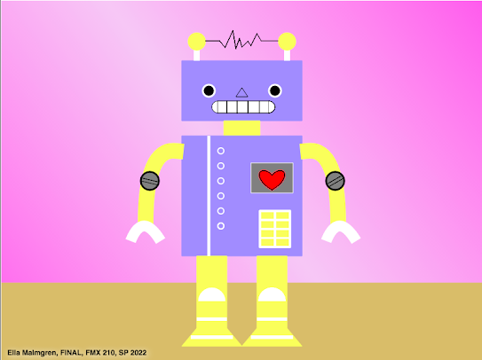
For my project, I decided to create the image of a robot. I found an image on Pinterest that I thought looked very clean and interesting, and decided to recreate it in my own style. I especially liked the static lines connecting the two bulbs on the top of the robot's head, so I wanted that to be included in the final design. At first, I ran into many problems with my code, because my computer isn’t compatible with Dreamweaver and I had to use Visual Studio code, which doesn’t automatically display the design. However, after I started to create the initial features of the design, I got the hang of it and this project was really fun to create. To incorporate the Bezier Curve, I added a heart on the robot to liven up the design. The most time-consuming part was creating the arms using the quadratic code because I had to sketch and plan the coordinates. In total, I spent about six hours on this project. Although it appears simple, I wanted to take my time on the details like the stati...