Logos
Final three logos:

Black & white initial sketch:

Black & white redone:
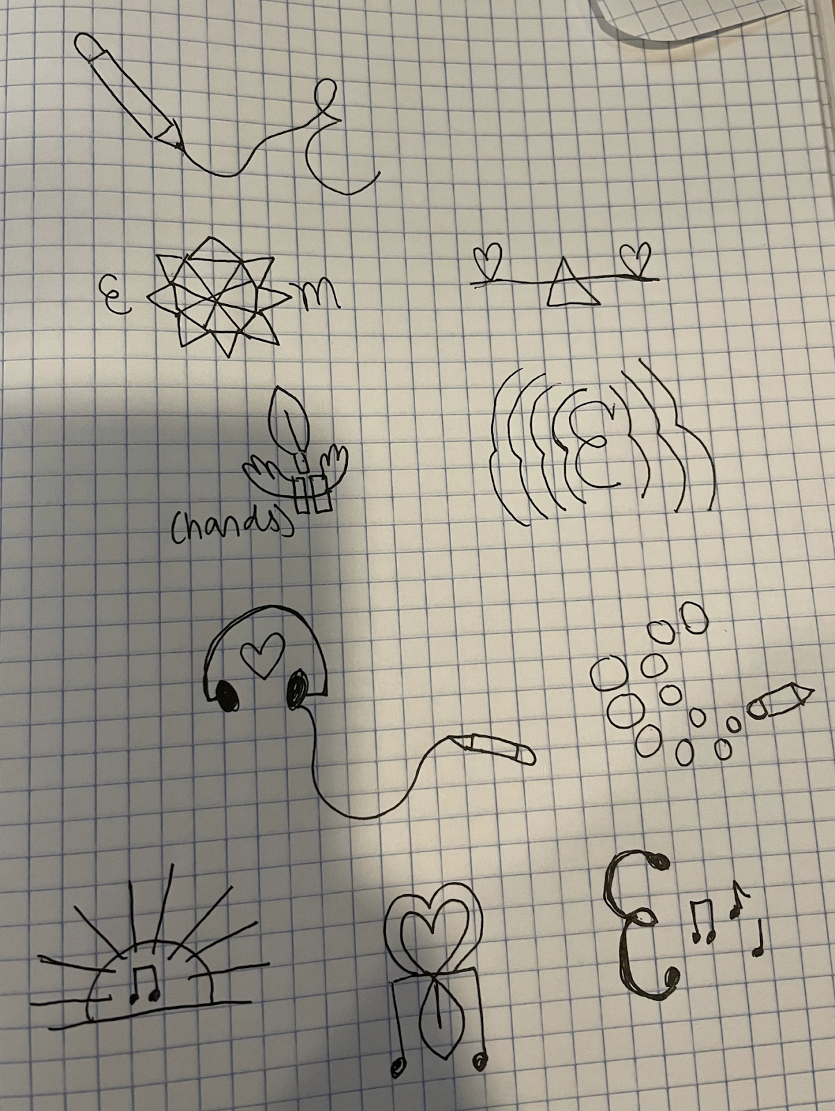
Sketches:
Artist Statement:
For my logo I wanted to create an image with a vibration to symbolize radiating positivity, because that's something that I think is really important in leading a successful life. My initial design had symmetrical vibrations around the letter 'E', but then when I tried to recreate the design it didn't look smooth on the right side, so I decided to only include the vibration on the left.
For the color choice, I wanted to first see how green looked because it's my favorite color. I created a yellow gradient vibration. I liked the green, but I wanted to also try it with red because I think it would look more bold, powerful, and follow the concept of a positive vibration. I also tried the logo with cool tones like purples and blues, but ultimately my favorite logo is the red one.


Comments
Post a Comment